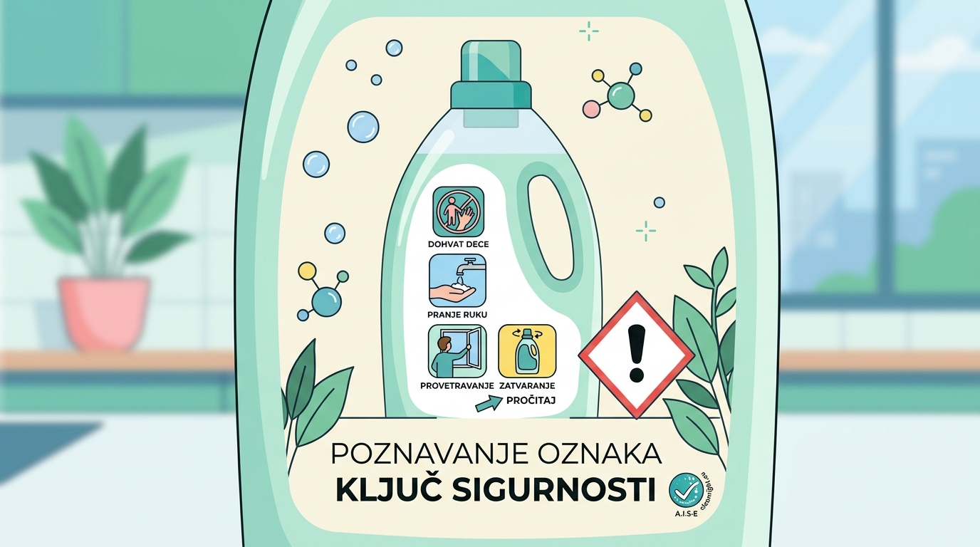
Detergent label icons: a short guide to the safe use pictograms
16/08/2026 | By Ivan Milenković
Almost every detergent and cleaning product carries a row of small pictures. A hand and a child, a drop falling into an eye, a mouth with a line through it. Hardly anyone explains these detergent label icons, and many people never notice them at all. Interestingly, no regulation requires them. They are a voluntary industry initiative, designed so that you can see at a glance how to use a product safely.
The set was developed back in 2004 by A.I.S.E, the European association of soap, detergent and maintenance product manufacturers. Since June 2026 the association has been called Detergents Europe, while the existing icons marked © A.I.S.E remain valid. The icons are free to use and appear across Europe, which is why you also see them on products on Serbian shelves.
Not the same as GHS pictograms (the red diamond)
This is where two things are easy to confuse. The red diamond with a black symbol is a hazard pictogram, and it is required by law. It tells you what kind of hazard is present, for example that the product is corrosive or harmful.
The voluntary icons do something else. They do not describe a hazard; they advise you how to use the product without an accident. One set is mandatory and tells you what is inside, the other is voluntary and tells you how to handle it. That is why you often see them side by side on the same label.
The core safe use icons
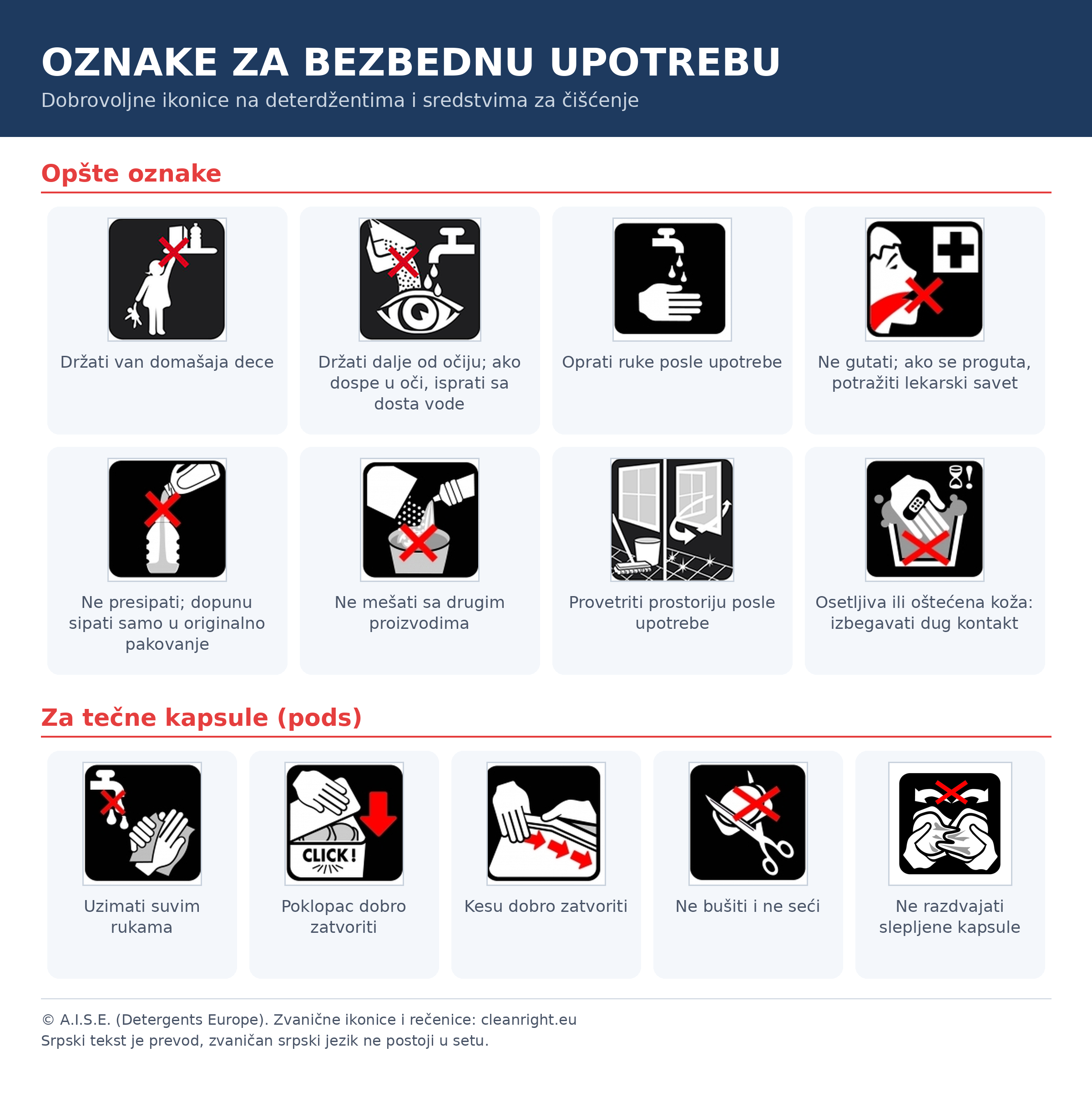
Eight icons appear on all types of products:
- Keep out of reach of children.
- Wash hands after use.
- Do not swallow. If swallowed, seek medical advice.
- Do not mix with other products.
- Keep away from eyes. If the product gets into the eyes, rinse with plenty of water.
- People with sensitive or damaged skin should avoid prolonged contact with the product.
- Do not decant into other containers. Refill only into the original packaging.
- Ventilate the room after use.
Each of them addresses one typical mistake. Pouring a corrosive product into a juice bottle can end in serious skin injuries. Mixing a drain unblocker with bleach releases toxic fumes. The icons were created precisely from real cases like these.
Icons for liquid capsules
Five icons are intended for liquid capsules, the colourful pods used for laundry and dishwashing. Their messages are: handle with dry hands, close the lid properly, close the bag properly, do not puncture or cut, and do not separate capsules that are stuck together.
The reason for a separate set is a serious one. Capsules have caused a large number of poisonings in children, because their shape and colour resemble sweets. That is why they carry more warnings than any other product, covering everything from handling to storage.
Hazard is not the same as risk
One point is worth clarifying, because it is constantly misunderstood. Hazard is a property of the product: its ability to cause harm. Risk is the likelihood that the harm actually occurs, given the way you use the product.
Crossing the street is hazardous. But if you cross at a pedestrian crossing and look left and right, the risk is small. The same applies to household chemicals. A product can carry a hazard label and still present a low risk when used correctly. That is where these icons help: they translate the hazard label into a concrete action.
Frequently asked questions
Are these icons a legal requirement? No. They are a voluntary industry set. Hazard pictograms, the red diamonds, are mandatory; these safe use icons are not.
How do they differ from the red diamonds? The diamonds tell you what hazard is present. These icons tell you how to use the product safely. The former describe a property, the latter give advice.
Why do liquid capsules have their own icons? Because of frequent poisonings of children who mistook capsules for sweets. The separate set puts the emphasis on handling and on storage out of children’s reach.
Where can I check what a particular icon means? On the cleanright.eu portal, which explains the icons in more than twenty languages.
Conclusion
A detergent label speaks two different languages. One is legal and warns of hazards; the other is voluntary and advises you how to act. The small icons belong to the second. They do not have to be there, but when they are, they are worth as much as the instructions for use. Read them properly once, and you will recognise them for good.
References:
This blog post is for informational purposes only and does not constitute legal advice. For specific situations, consult a licensed chemical adviser or a lawyer specialising in chemical regulation.
← Back to blog